Wonderlit is a kid friendly cafe/library. This brief for this was to remain childlike, while still advertising it is a coffee shop.
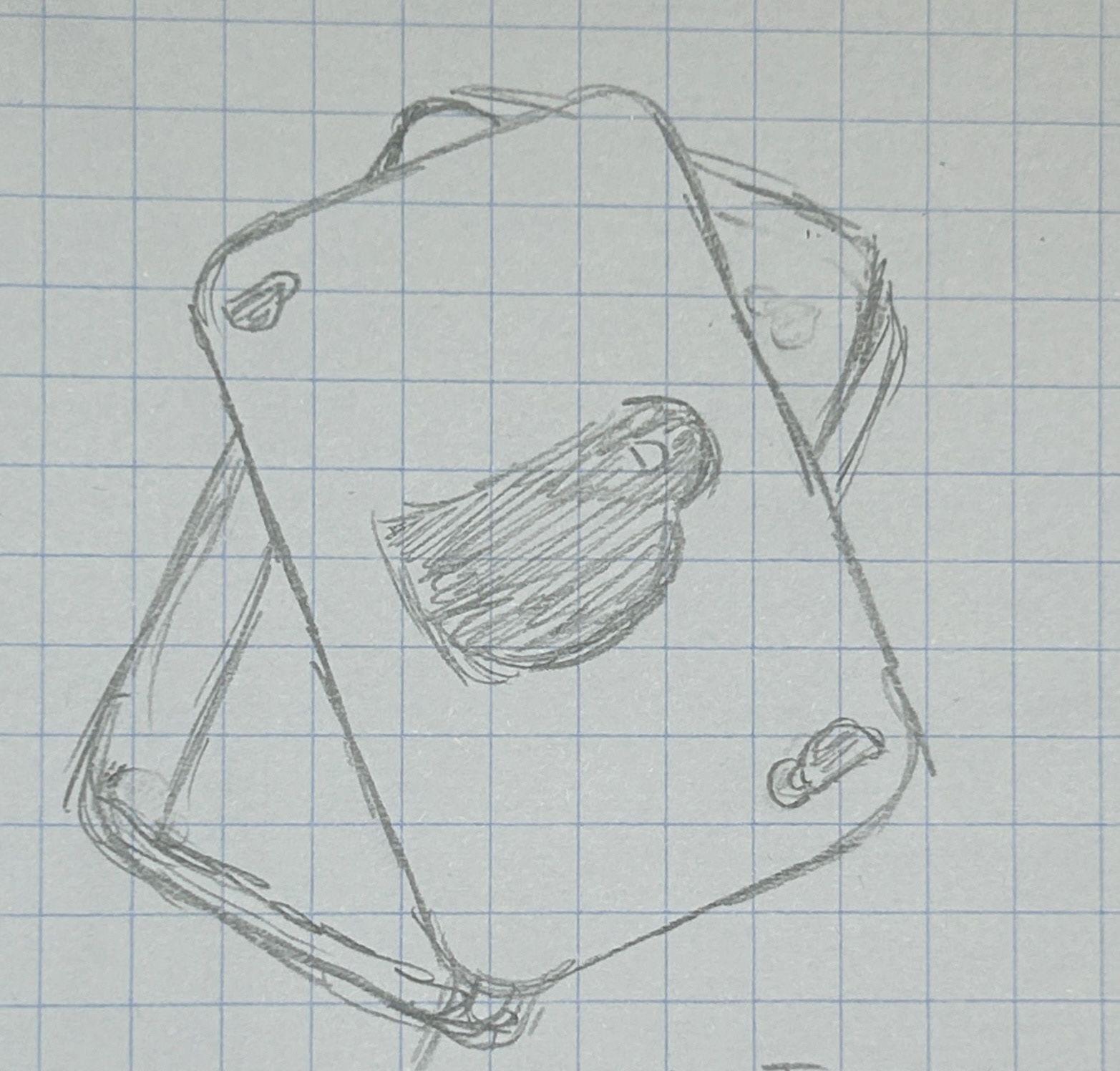
In order to remain childlike, my first idea was to somehow involve magic with some sort of symbol of coffee like the cup. However, after several attempts, I didn't think it was going in the direction I had hoped for.
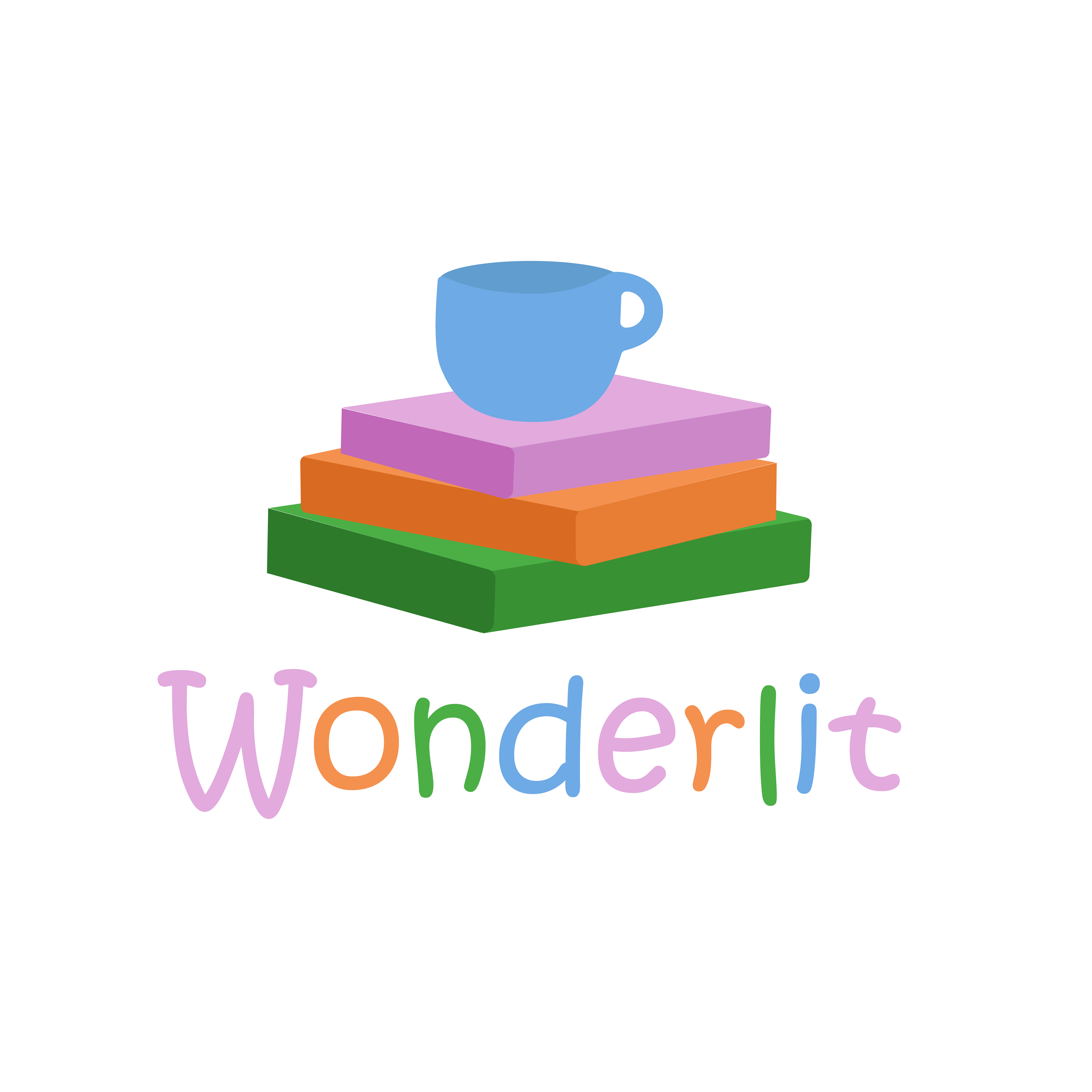
I decided to try another direction: Kids toys. Something you see quite often is stacking blocks. My idea was to make these blocks actually in the shape of books to represent the library portion while stacking the coffee cup on top. I felt that this version represented the brand better.
When adding the typography, I wanted it to give off the same childlike feel, however, script fonts tend to be illegible so I looked for something else that was playful, but still legible and found the font you see in the image.
I really enjoyed the playfulness of this project and the creative freedom I had to be playful with it!
