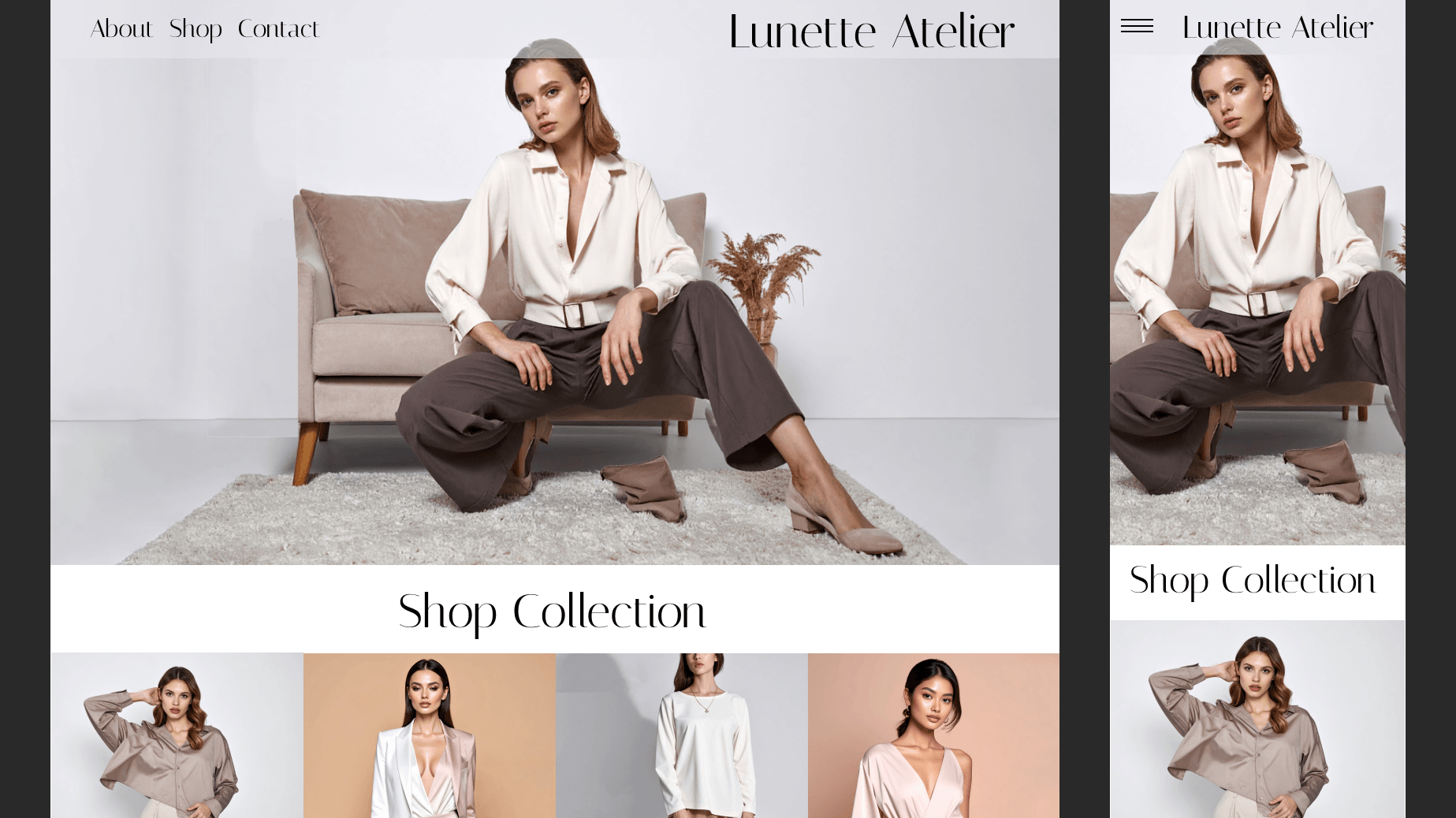
Popcorn Revolution
I asked ChatGPT to provide me with a creative brief that would involve several aspects of a complete brand identity package. I was to create a color scheme, choose the typography, create patterns, a logo, product design, a business card, social media templates, and mockups.
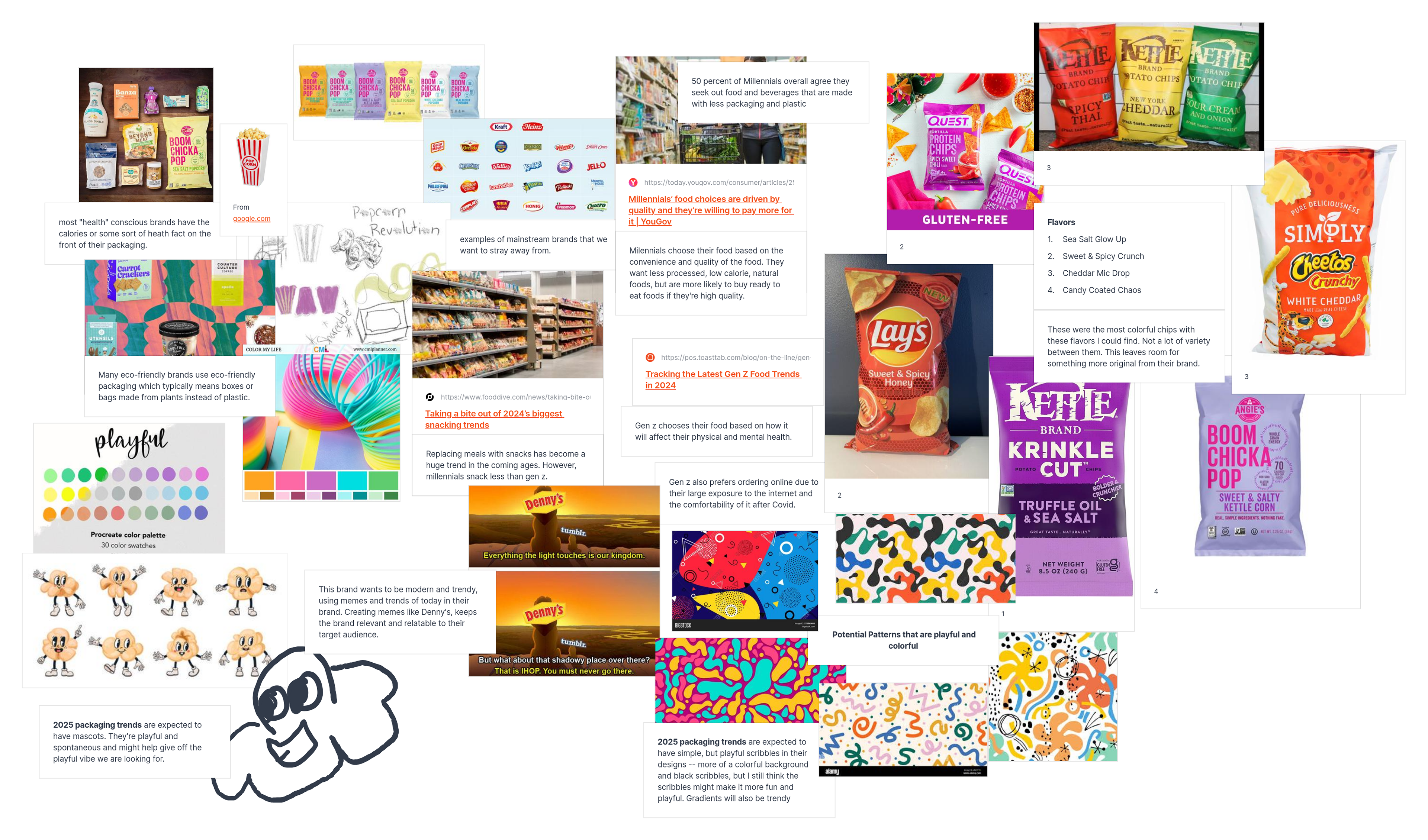
I started by doing research based on the information given to me by ChatGPT like target audience, product type, company mission, etc.
Then I began working on the color palette and typography to start.
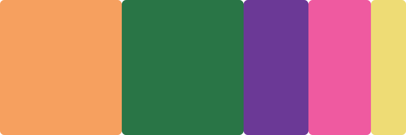
I went through several different palettes and explored who they would look next to each other and on top of each other. By the end, I felt that these four colors complimented each other and gave it the playful feel that they client desired. I also used the 60-30-10 rule to help better prepare this color palette.
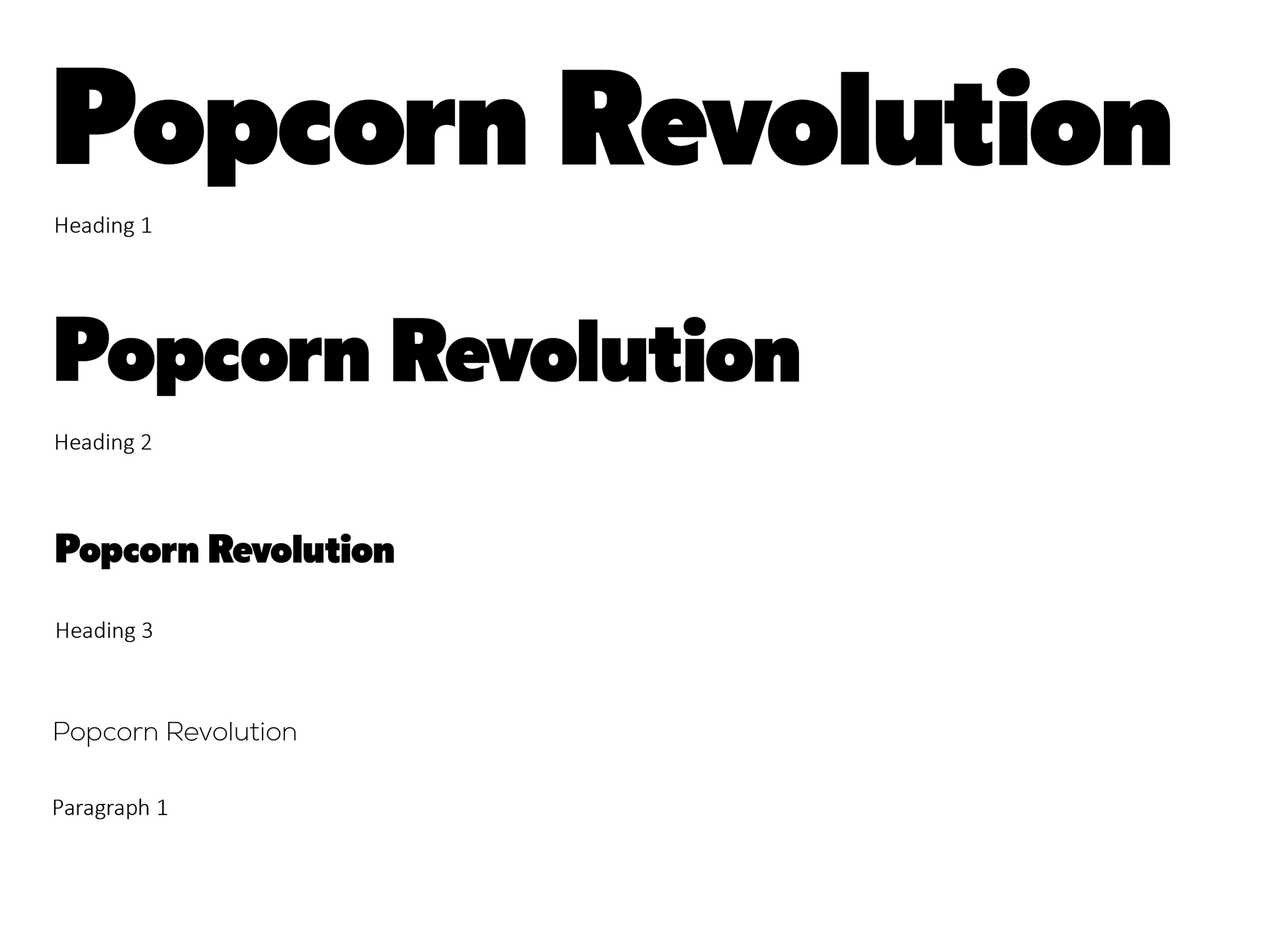
I used two different typefaces so that the client can have one for headings and another for longer paragraphs. The typeface used for the heading provides that nostalgic feel and is bold and legible. The typeface used for the paragraphs is a sans-serif typeface that is highly legible when smaller, but still provides the same nostalgic feeling as the heading.
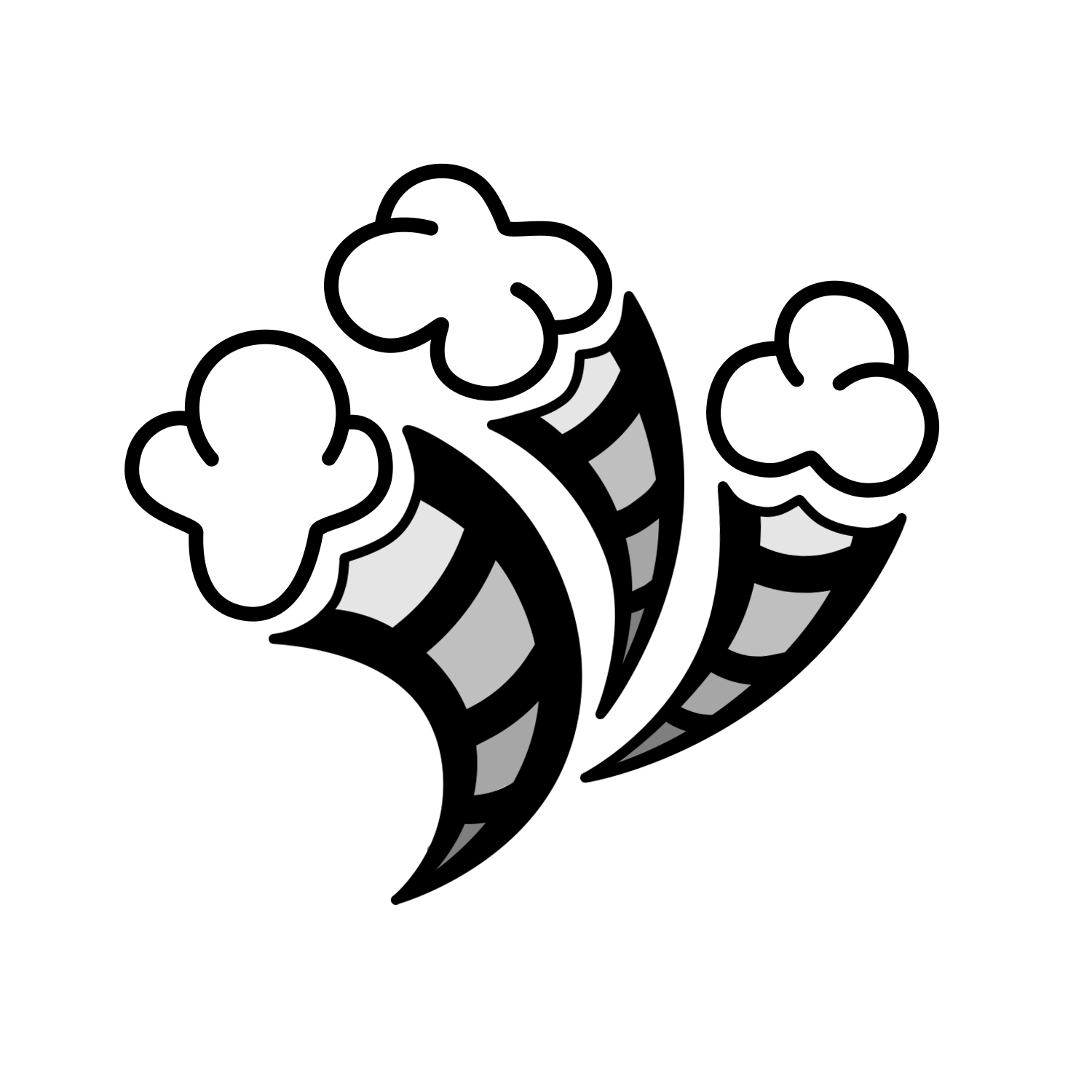
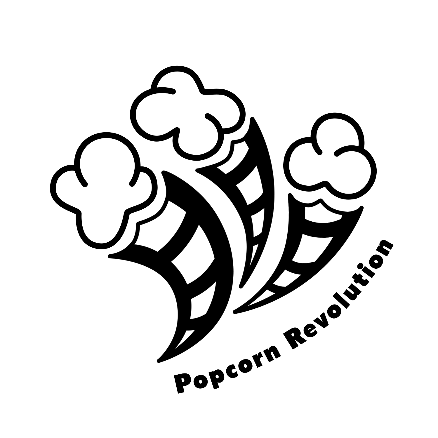

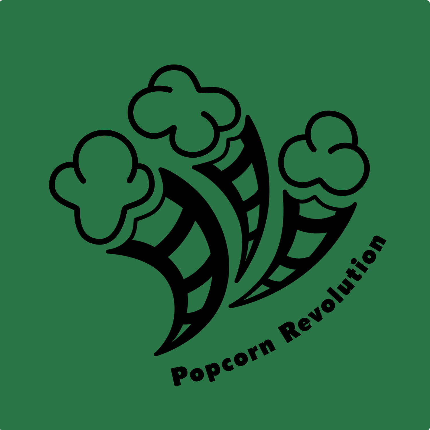


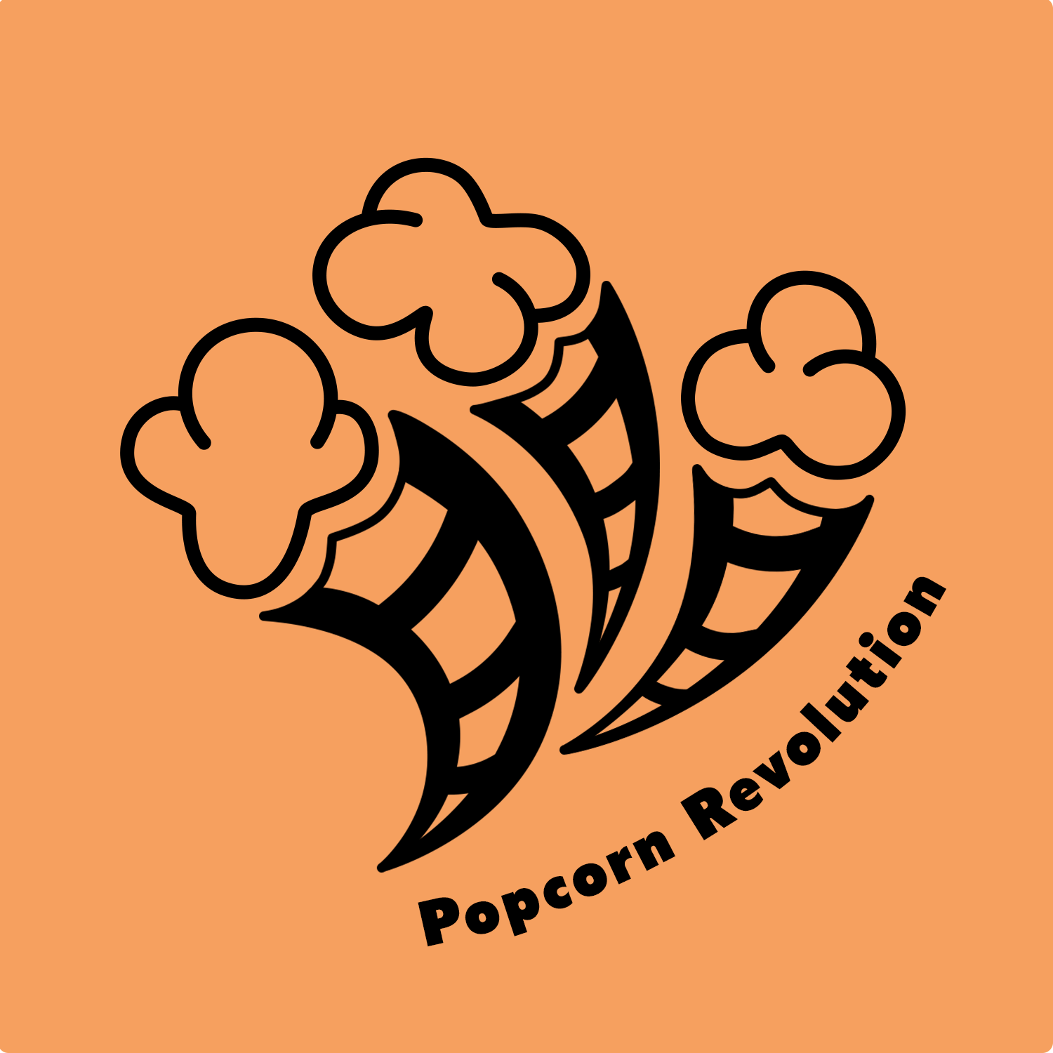

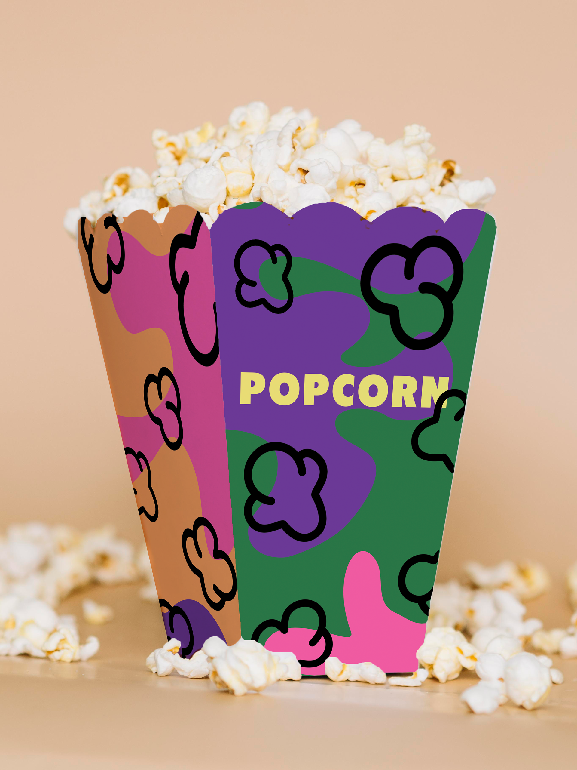
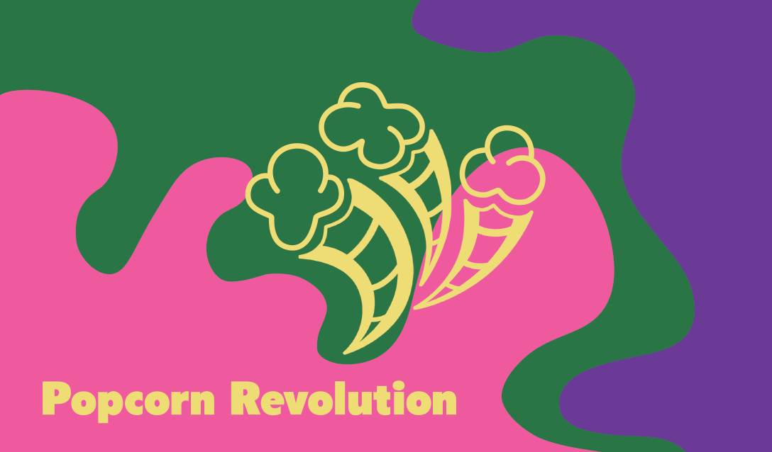
I then began experimenting with different logos and landed on this one as the best option to capture the playful feel while also following the predicted 2025 trends for design. I wanted to use the film under the popcorn to also give a sense of nostalgia. To make the film more recognizable, I added the inside film as well. This version also adds a bit more depth to the logo.
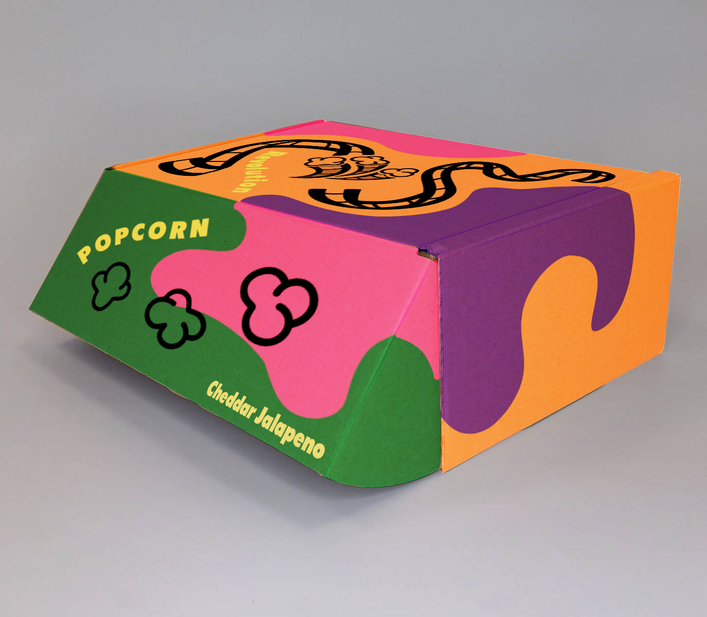
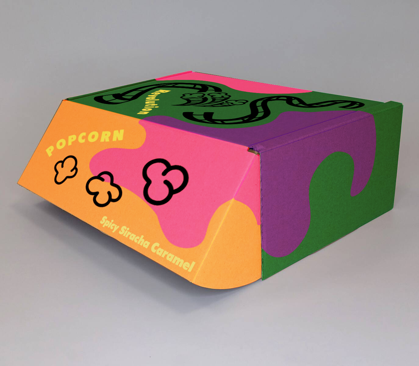
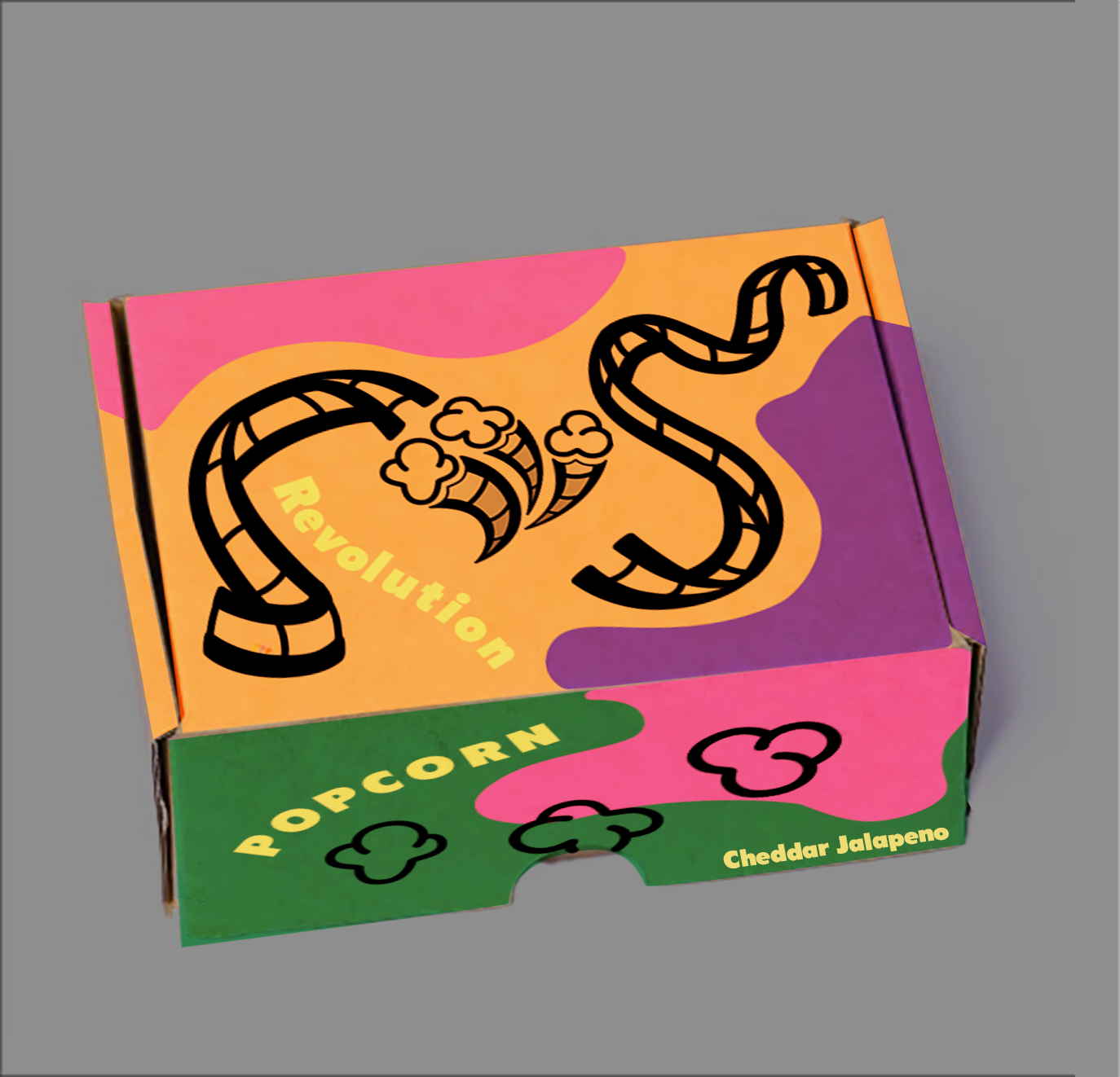
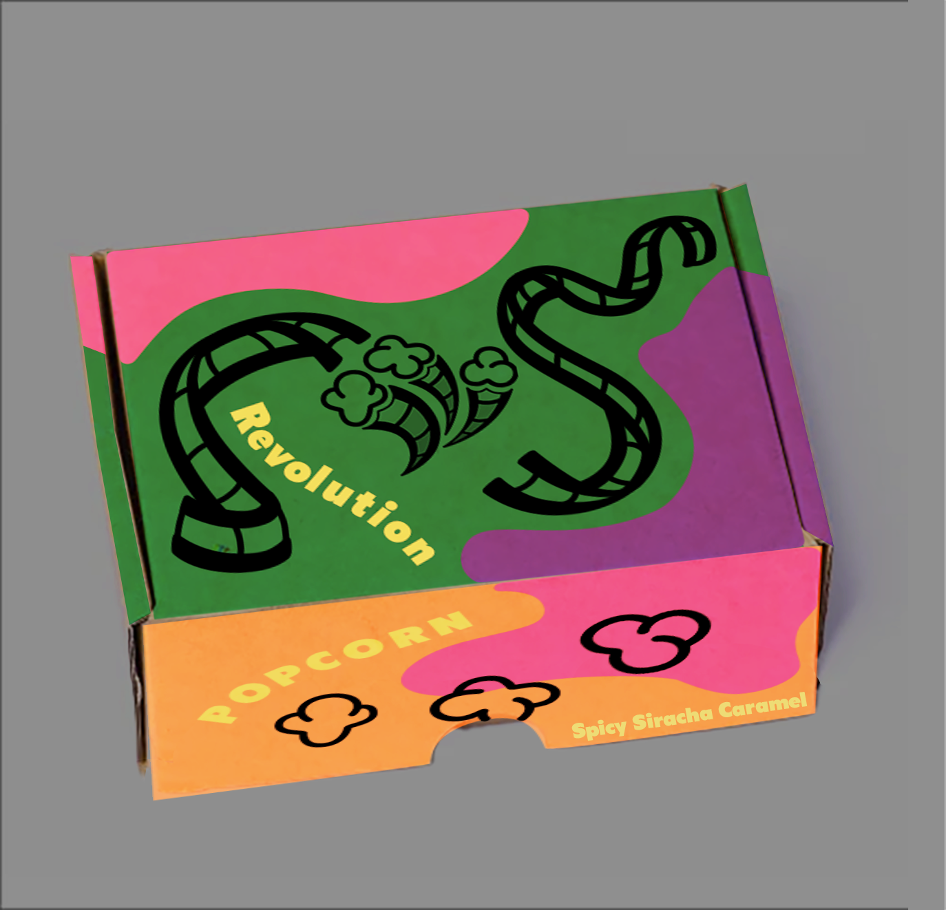
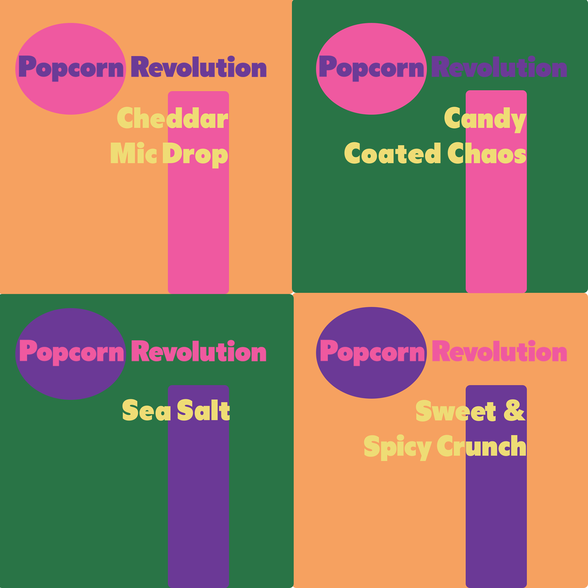
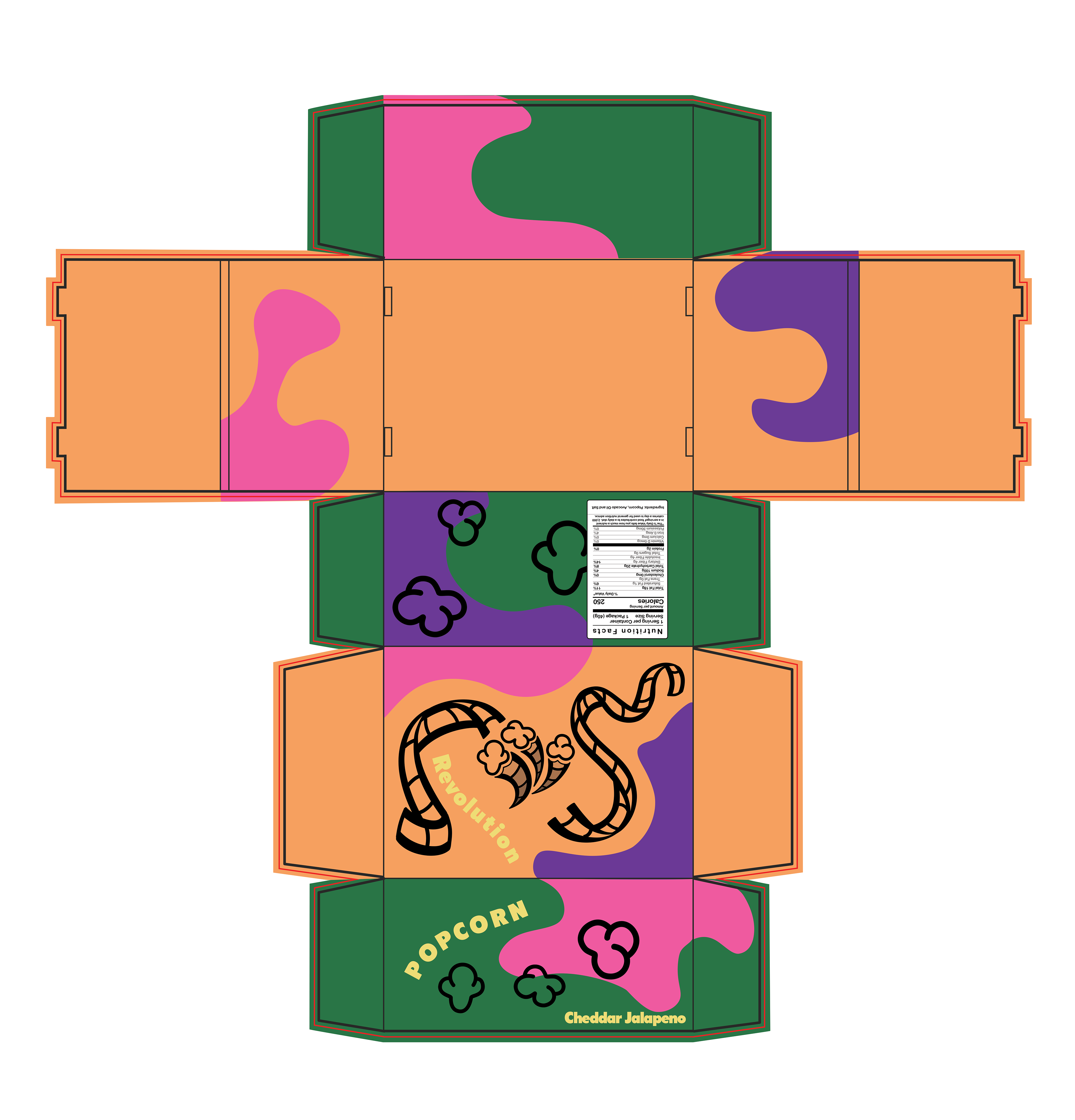
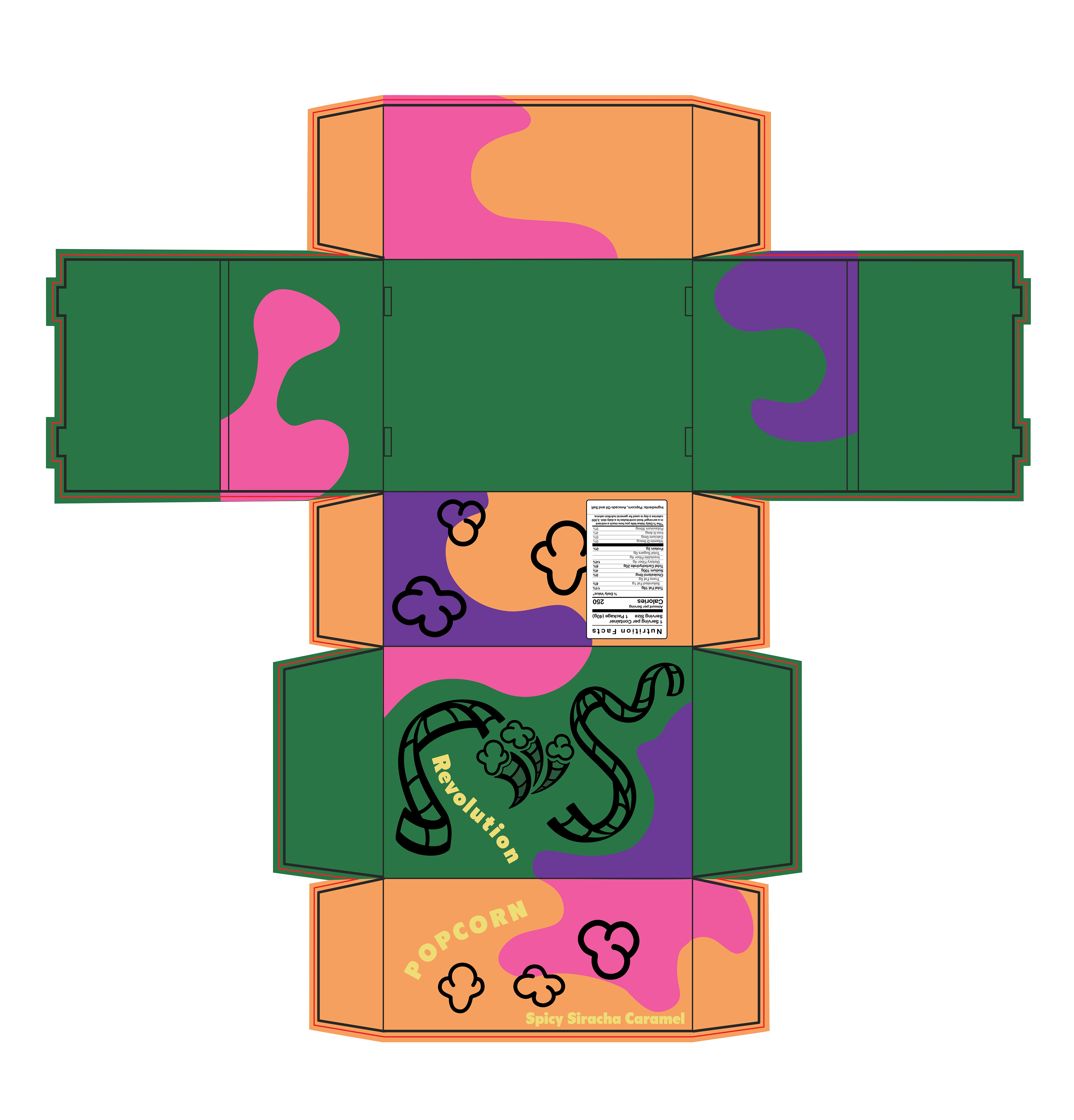
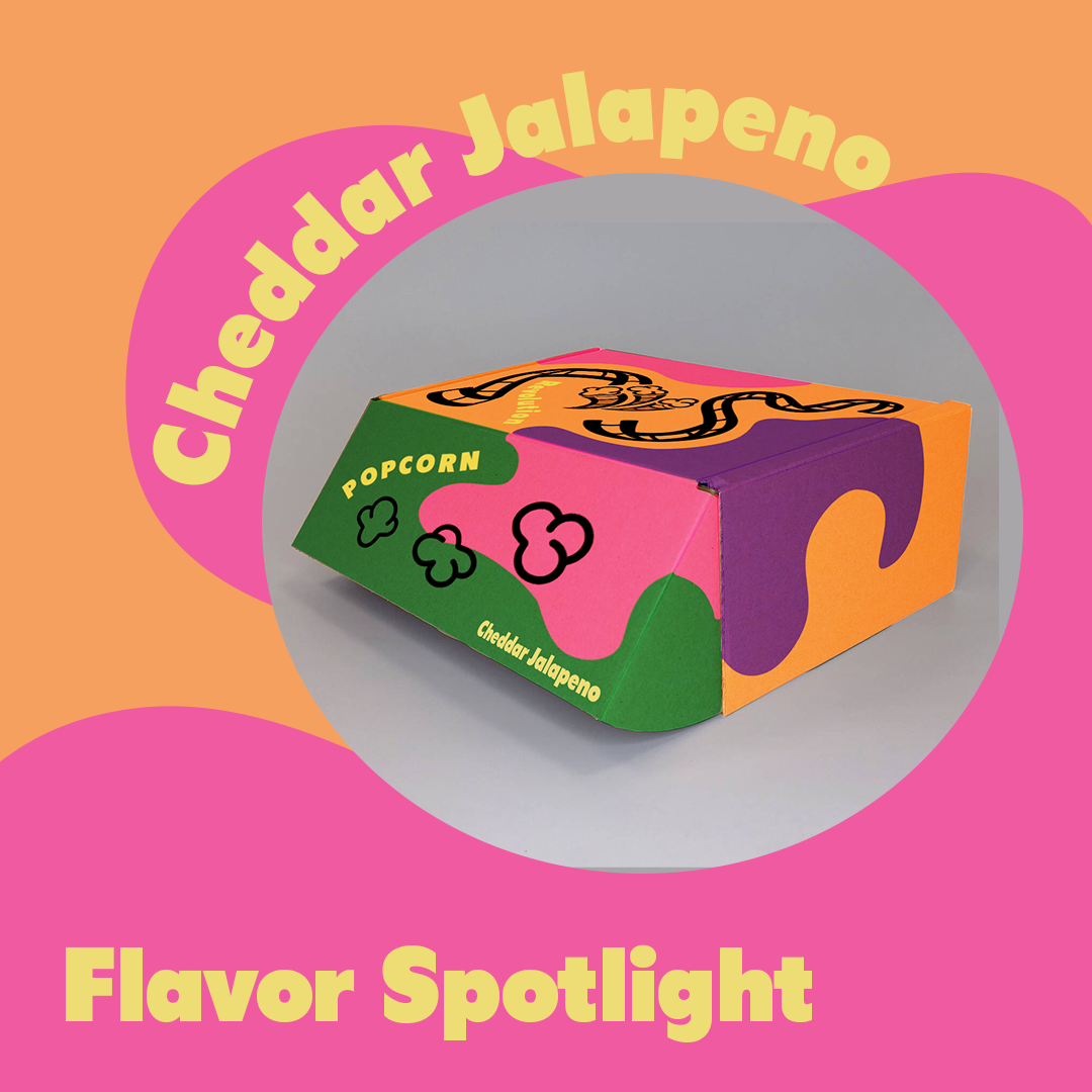
I finished the packaging for this product. The customer wanted something colorful playful, but nostalgic. I used the secondary colors to play with shapes through out the box that follow the flow of the film on the top of the box. This takes you throughout the box, and invites the consumer into the product.
I wanted the words to match the playfulness of this design, but since the front flap is most likely the first thing a consumer will see if it is on a shelf, I wanted to make sure they will know what the product is while inviting them to find out more.
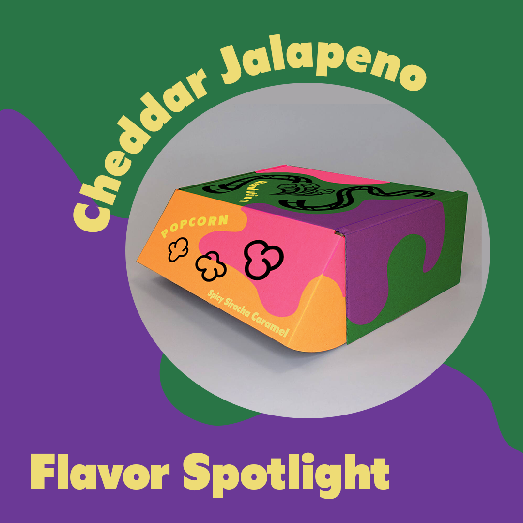
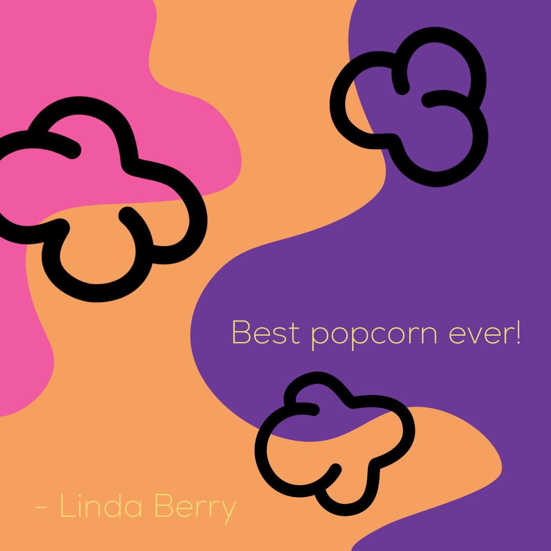
I then began working on the social media posts. I have created two templates for the following topics:
- Flavor Spotlights
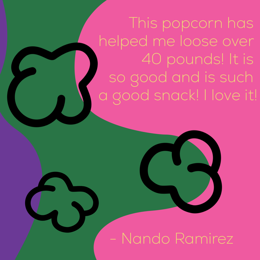
- Customer Testimonials
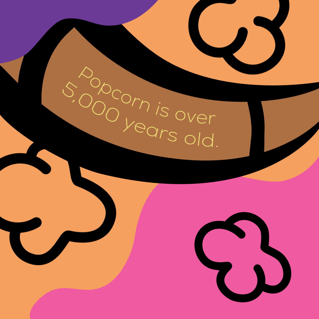
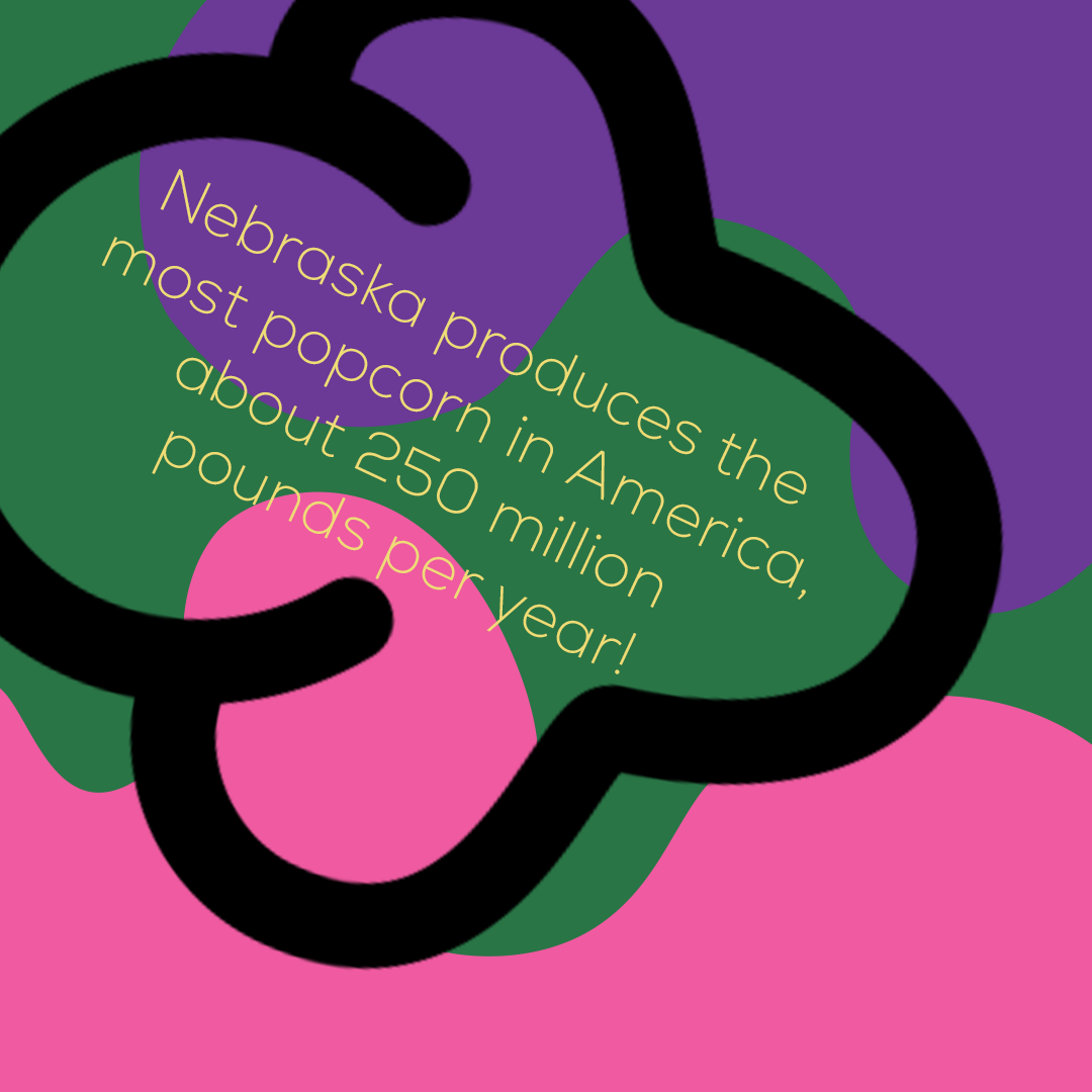
- Fun Facts about Popcorn
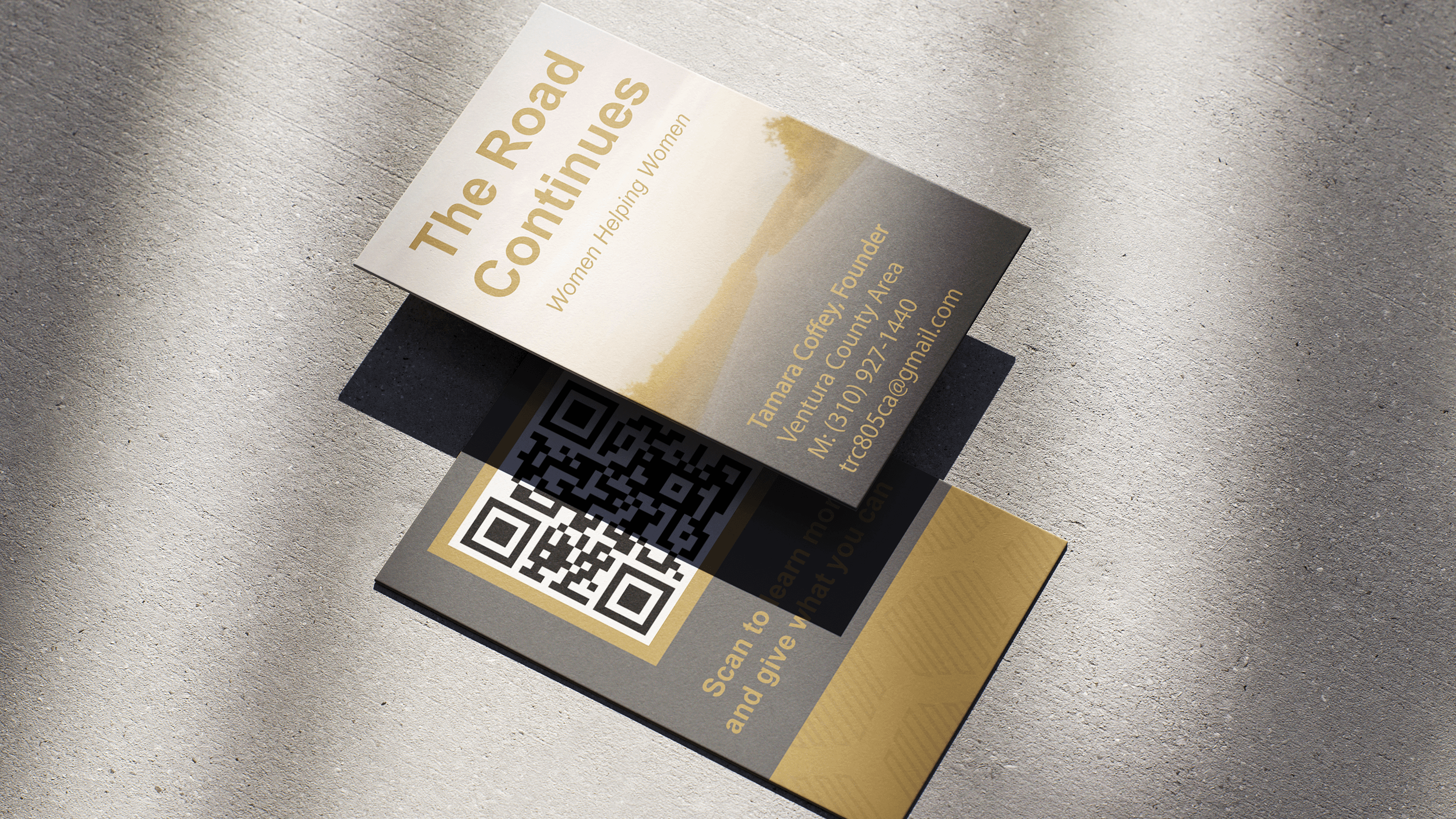
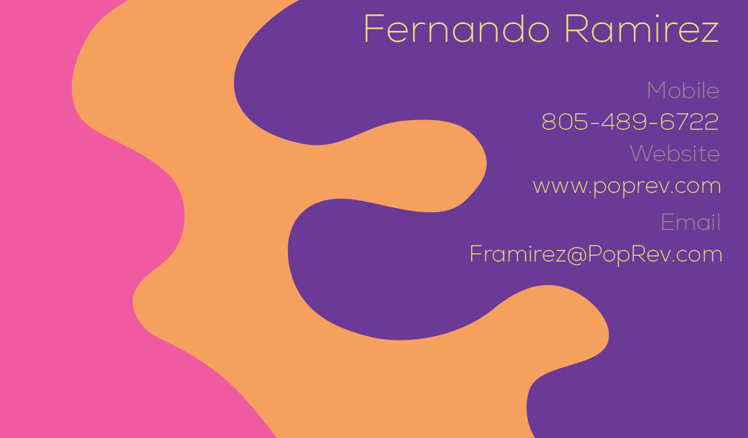
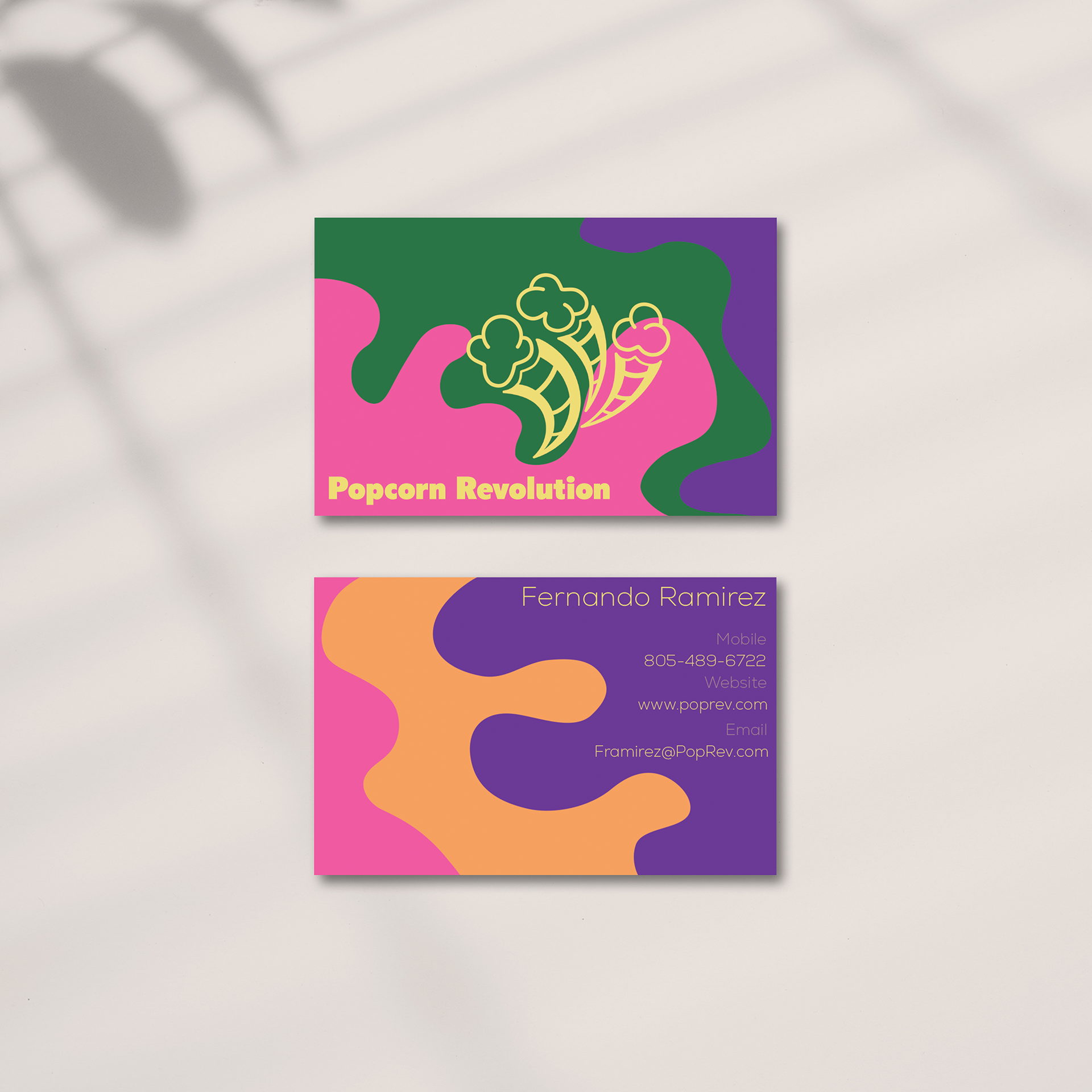
I then began working on the business card. I had the logo be the accent yellow to add a bit more emphasis to it.
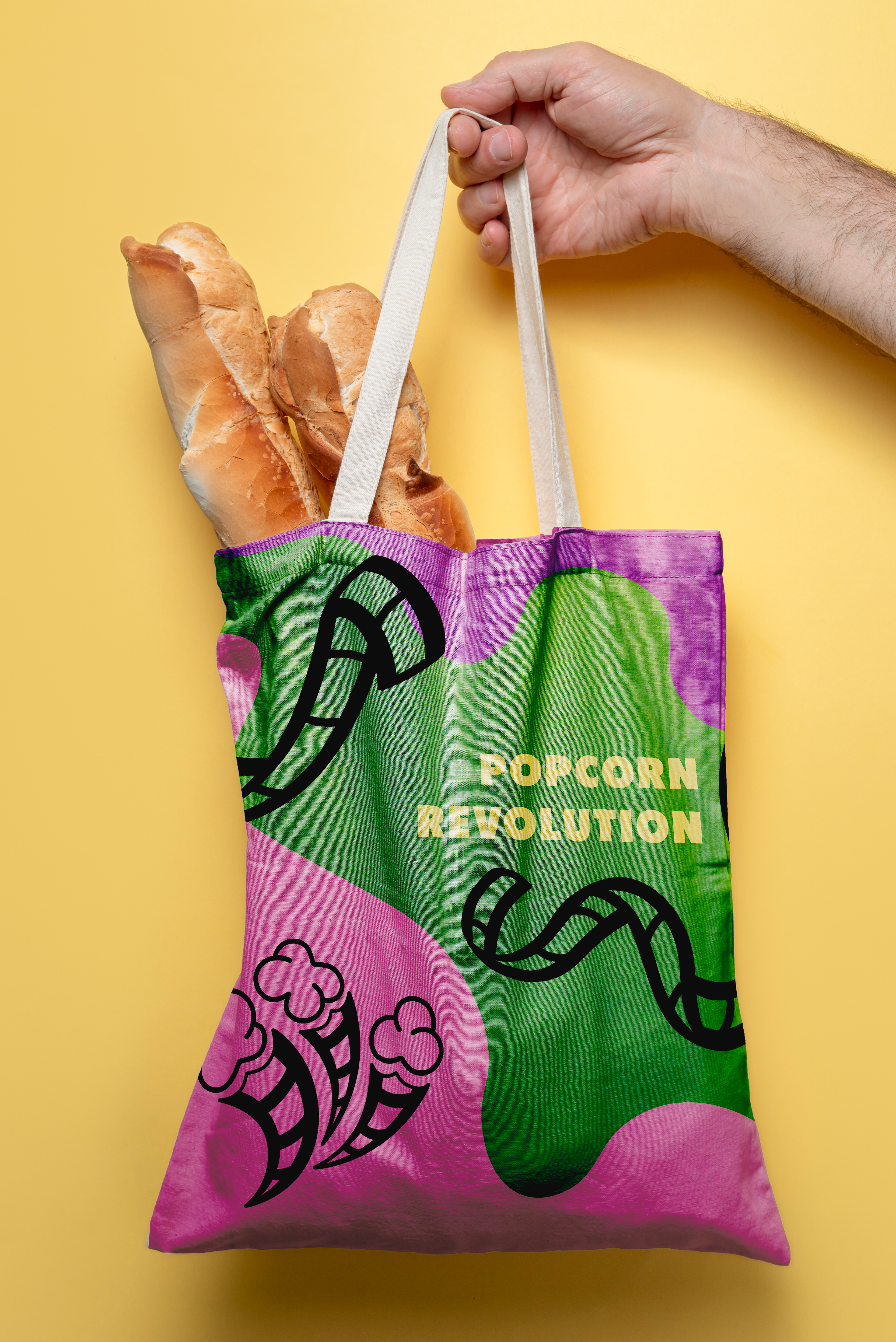
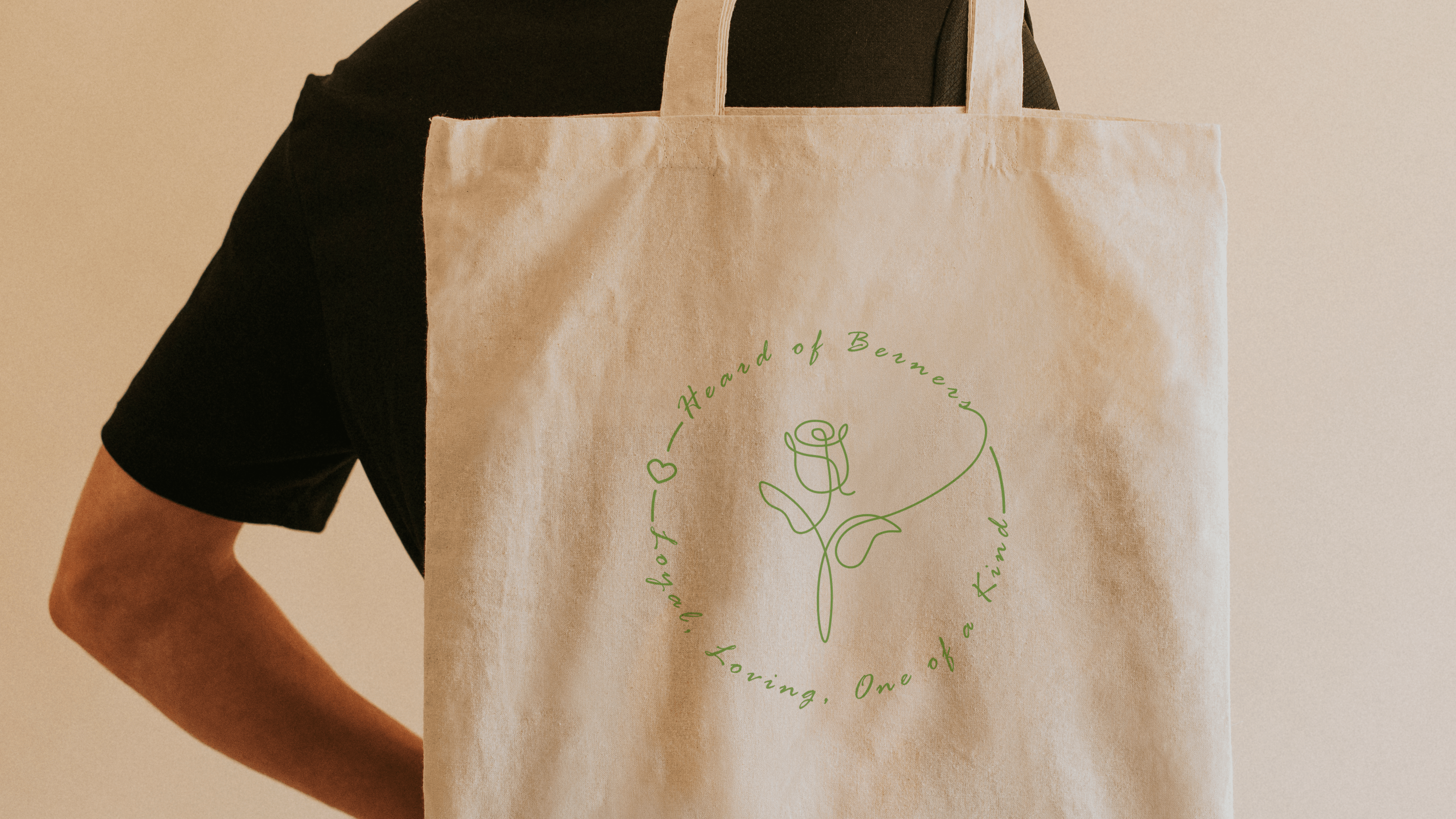
Next, I put together a couple of mockups that showcased merchandise that this company might sell. I did a popcorn bucket of course, as well as a tote bag since that is typically a popular merchandise item that most people love.