A Purple House is a business that is inspired by the owners love for crafts. She wanted to update her logo as she felt it was time to get something professionally done.
During our initial briefing, we discussed creating something weirdly unique like a lot of the items she crafts, but at the same time professional.
If you take a look at her Instagram, you will see that she creates a lot of crochet patterns on there with such interesting designs. She also had an Etsy account where she would sell a lot of small items like bones or other curious items inside of jars. The one thing a lot of them had in common was that they were all often enclosed in a jar (yes, even her crochet designs!).
She was also well known for quite literally having a purple house so we discussed the idea of keeping that part of her original logo alive as well as things like use of negative space and of course using the color purple, but making sure it stays accessible to read by all.
My idea behind this logo was to keep the house idea but somehow contain it in the jar. We did go through a few rounds of revisions with this one because of the spacing with between the jar and the house was just not lining up how we wanted in the original concepts. We eventually landed on this after a few revisions and I could not be happier with how it turned out!
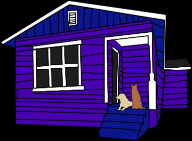

Above is a side by side of her original logo and the newly designed logo.
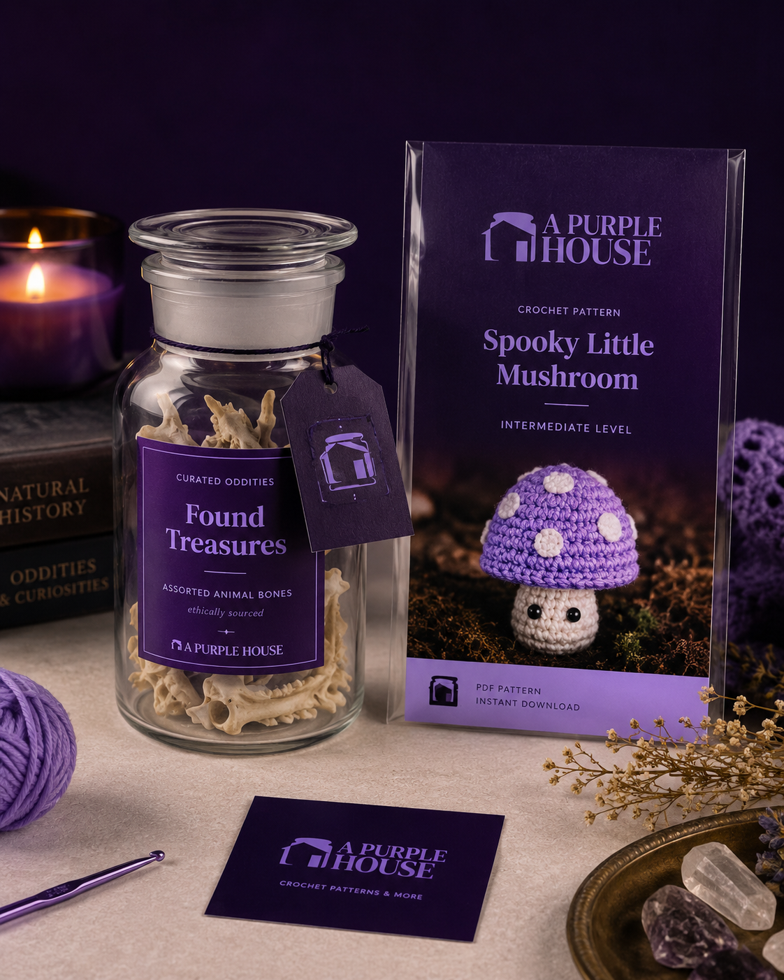

Used AI to create some quick mockups with her colors!